A Look Into the Top 10 Millennial Brands
Often, we are asked to, or what, captures Millennials attention. Right now, they are the “Holy Grail” of marketing. There are currently 83 million of them, with the most buying power out of any other people group alive today. And the most educated generation ever.
Instead of recreating the wheel, we turned to the top 10 companies already succeeding in the Millennial marketplace, and dissecting their entire brand.
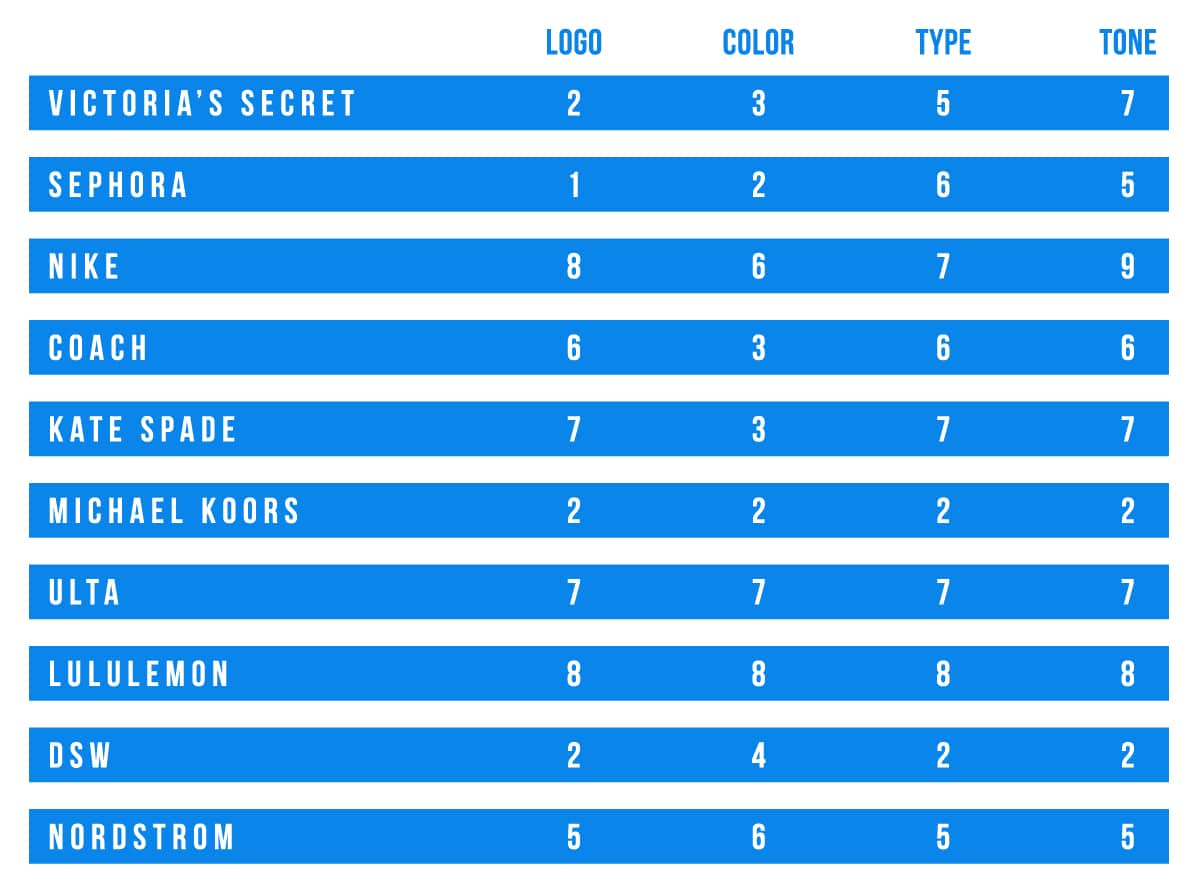
According to a 2017 survey by Condé Nast and Goldman Sachs, the following are the top 10 brands shopped by Millennials. For the scale, we used an “are you freaking kidding me?” as a 1, and a score of 10 means that was a perfect decision.

Logos
DSW, Michael Kors, Nordstrom, Sephora, Victoria Secret, Ulta have wordmark logos. The remaining four have a symbol that recognizable by a checkmark or spade.
This is almost a 50/50 split, so no real conclusion can be drawn here.
In my opinion, however, it would be more beneficial for a brand to be recognizable by their brand and by a symbol. Whenever a consumer sees that symbol, separate from a brand, in the wild, he or she will immediately think of that company. In addition, it helpful with actual consumer good packaging.
Color
With the only exception of Lululemon, which has three colors, each of these brands typically play with two colors. Even more, the majority stay in black and white. But, with all, white plays an imperative role in the brand pallet.
It’s minimalistic, simple and, much like a symbolic logo, can remind a consumer of the company if the color is seen outside of the branding.
Type
There is an equal 50/50 split between logos that use serif and logos using sans serif. The two beauty brands, Sephora and Ulta, use sans serif. The clothing brands, however, are mixed. The higher end brands (Michael Kors, Kate Spade and Coach) each use a serif font, but Lululemon, a high-end athletic brand, uses sans serif.
Typefaces will be debated for the rest of time. Sans serif fonts, of course, are more minimalistic and simple, which is parallel to using up to three colors in each logo.
Conversely, serif fonts are argued to be more legible, and easier to read in advertorials, which are often used as marketing tools in traditional forms of advertising.
Tone
Victoria’s Secret – No catchphrase, just a focus on the word “Sexy”
Coach – No catchphrase
DSW – Designer Shoe Warehouse.They’re very upfront and open about their anagram. They also use an oxymoron, placing “Designer” and “Warehouse” next to each other.
Kate Spade – No catchphrase, but their young, classy and quirky tone is seen in throughout their font, continuous use of only lowercase words and choice of words, such as “lovely” or “classics with a twist.”
Lululemon – No catchphrase. I can’t tell a tone from their website or social channels.
Michael Kors – No catchphrase, but their beige and golden imagery immediately tells me I cannot afford this brand.
Nordstrom – No catchphrase, which leaves me questioning if I can afford products inside this store (is it a brand? A warehouse? A TJ Maxx kind of place?) or not? Clarity could be helpful to this brand.
Ulta – “All things beauty. All in one place.” Already, I like that I don’t have to go to two stores to find two different brands of a beauty or makeup product. They’re selling me on convenience.
Nike – “Just do it.” It’s motivating, it’s encouraging and it’s a little bit of tough love.
Sephora – No catchphrase, but based on their website and keywords, I can tell this brand is only makeup and beauty products, instead of clothes or food.