eCOM Chic

Today is gonna be a good day.
I’ve got a frothy, hot cup of coffee, I actually packed a lunch and according to the FedEx tracking page that I’ve refreshed for the fourteenth time—my black leather Kelsi Dagger stacked heels are here, waiting for me at the front desk.
Part of the reason why delivery day is so exciting to me is that it took a lot for me to reach this point in the shopping process. You see, I don’t take online shopping—rather, the act of online purchasing—lightly. Pre-online purchase plunge, you can find me knee-deep in product pages, searching every which way Internet-ly possible to find the very best deal on a certain pair of espadrilles or ceramic antelope antlers. Oftentimes, I will have at least three conversations going at once, seeking the approval of a potential purchase.
My mom on text:
“I don’t know, do you think they would look weird on?”
My best friend on Gchat:
“I could totally wear these A LOT this season. So they would be worth the price, right?”
My coworker on email: “Bet you if I wait until tomorrow, they’ll send me a 30% promo code…”
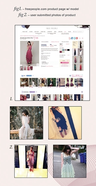
And I don’t stop there. I have a new habit of discovering the true product name and performing a Google image search on said product to see whether the shoes, shirt, or table lamp in question has been worn and blogged about or photographed in any other angle that makes it more or less appealing. This is all after I have scoured the product page for reviews (better yet, reviews with pictures), zoomed in on every minute detail and reviewed the product detail list to ensure that the upper is in fact made out of REAL leather. Some may call this neurotic, but I like to think of it as thorough. And though I understand that not every online shopper goes to such great lengths before, during and after purchase—my compulsions may prove helpful for devising ways to make your consumer’s eCommerce experience more poetic. Here are some techniques that I like… 
THE HOMEPAGE
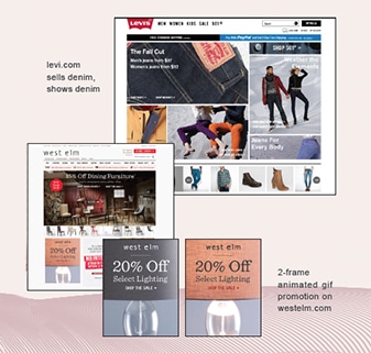
Your homepage is your initial opportunity to get the user amped about your product and entice them to check out the rest of the site. Don’t be afraid to show your wares in action. Gifs, motion graphic videos and high quality photography do this really well. It’s also important to be very clear about what your site is selling. If you’re a high-end denim retailer and your homepage has no jeans in sight, your user might think they have come to the wrong page and bounce.
PROMOTIONS & OFFER CODES
Also important is displaying your promotions where everyone can see them: right at the top or on the right side of the screen. Sales and incentives are a superb way to encourage users to check out the rest of your site—because there are only a few iron-walleted window-shoppers that can resist saving an additional 50% off sale items.

SEARCH & NAVIGATION
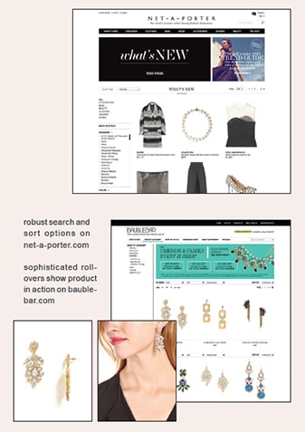
Strategic product categorization is extremely important if you want users to be able to easily navigate your site. The categories should be easy to understand, legible and visible, no matter where the user is within the website. Be super savvy when planning your search function. If your site boasts products of different brands, it’s likely that your user will want to search for specific brands and specific items made by those specific brands. And, although years of being in the fashion industry has made you a wizard of vestment vocabulary, not everyone knows what voile means… so, plan for that.
PRODUCT LIST VIEW
In a perfect virtual shopping world, I am able to quickly sort products on the list view page by price (high to low, low to high), highest rated and what’s new. Along the left side of the list view page are the more detailed features, like color, fabric and size. Another product list feature that I have found extremely effective is image-swapping upon rollover. Say a pair of statement earrings catches your eye, so you meander your mouse over to it and the picture changes from the product on a stark white background to the earrings on an actual person. Pure brilliance. All without leaving the list view page.
PRODUCT PAGES
The product page should do everything possible to assure and inform the user about the product. High quality photography should highlight every nook, stitch and zipper with zoom in/ pan out functionality. Also important is giving the product perspective. If it’s a handbag, show it on a real shoulder, if it’s a rug, show it on the floor in front of a couch with a dog on it. It helps the user visualize the product in their own home or on their own arm. And if they can do this, they are much more likely to buy it. Also paramount are the product descriptions. People really do read them, I promise. This is where you should get into the real nitty-gritty of what the product is made of, the exact measurements, whether it’s dry-clean only, etc.
PAYMENT OPTIONS & PROCESS
Making the payment process strikingly simple should be a no-brainer. Offering several payment methods, storing credit card information and shipping addresses, and gamification tactics—such as a progress bar—are excellent ways to do this. And don’t forget that mCommerce (both smartphone and tablet) represents 10% of all digital commerce, so designing with these users in mind is key to a well-rounded user experience.

PRODUCT REVIEWS
I realize that this list may be a tad daunting. I have only just begun to graze the surface of creating a superb online shopping experience. So, if you’re looking for that one shiny nugget to take your site to the next level, I leave you with this:
The key to successful eCommerce UX is to make online shoppers feel as comfortable buying from your eCommerce website as they would from stepping into your store. Master this, and online shoppers like me will be flocking to your site in no time.